A good logo can loosely be defined to fit 5 main categories in its creation. At Sydney Logos we try to stick within these 5 principals thus to ensure your logo is an effective branding and marketing icon for your business. In no particular order the following is a list of these 5 principals that need to be taken into consideration when constructing a logo.
1 – Basic and Describable
A logo that does not have too many elements or colours is far more recognisable than a cluttered one. Which is why the challenge is to create something that is simple yet at the same time maintains a unique and different shape. A good logo will display what it is without been too detailed, and easy to describe. How would you describe the ‘Apple’ or ‘Nike’ logo to someone?
2 – Memorable and Unique
Simple is generally a pre-requisite for a memorable logo. It works hand in hand with the above point. Many businesses make the mistake of going for a cheap logo that tries to display to much information or to detailed and many elements competing with each other that it becomes confusing. Your logo is there to represent your business, as an icon. You should be remembered as an image that’s pleasing to look at, different to others and simple enough so that someone could even roughly draw it freehand.
3 – Works well in monotone, timeless
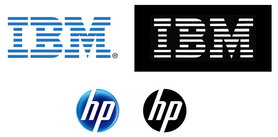
Logos more often than not need to be applied to a wide variety of different media. This includes different coloured backgrounds that sometimes you cannot change. Your logo might work wonderfully on a white background but look terrible and illegible on a darker background or heavy pattern background. Your logo should work independently across any surface in black or white so there is no difficulty in distinguishing the brand. Your logo should also stand the test of time. 10 years from now you don’t want to have your logo ‘outdated’ in its design. It should remain a strong brand that will always look modern.
4 – Versatile and Scaleable to any size
Theoretically your logo should be seen on the moon from earth if it was expanded to that size. Alternatively it should also be recognisable when shrunk to miniature proportions. Your logo should have the flexibility to be applied to any sort of media from billboards to business cards and not lose any of its impact.
Stage 5 – Relevant
Almost most important of all is to make sure your logo reflects your actual business. A successful logo sometimes doesn’t even need to be ‘read’ for the viewer to understand what type of business it is. Your logo should represent what your clients expect of your business, depending of course on your target market. Trends and design aesthetics can also influence the overall look and feel of your logo.
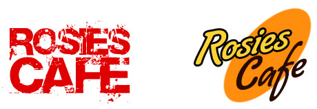
Which of the two logos below is more likely to represent a ‘traditional’ cafe?


